Responsive & Mobile Design

Responsive & Mobile Design
involves creating websites and
interfaces that adapt and function
seamlessly across various devices
and screen sizes, ensuring optimal
user experiences regardless of the
device used. It encompasses
designing layouts, navigation, and
interactions to be fluid and intuitive,
catering to the increasing number of
users accessing content on
smartphones, tablets, and other
mobile devices.
In today’s digital landscape,
Responsive and Mobile Design is
paramount for ensuring accessibility
and engagement across diverse
devices, aligning seamlessly with
Paesh’s commitment to user-centric
experiences. By prioritizing
adaptability and usability, Paesh
empowers businesses to reach and
resonate with audiences on the go,
fostering brand loyalty and driving
conversion in the dynamic world of
mobile commerce.
responsive-design-1
responsive-design-2

Device Compatibility
Assessment

This initial phase involves analyzing the range of devices, screen sizes, and resolutions that users may utilize to access the website or application, ensuring
compatibility across various platforms.

Wireframing
& Prototyping

Here, designers create wireframes and prototypes of the user interface, mapping out the layout and navigation flow to optimize usability and functionality on
different devices.

Flexible Layout
Development

In this stage, developers implement responsive design techniques using HTML, CSS, and JavaScript to construct fluid layouts that adjust dynamically based on
screen size, ensuring a consistent and user-friendly experience across devices.

Testing &
Optimization

The final phase involves thorough testing across different devices and browsers to identify and resolve any compatibility issues or usability concerns.

We replace unreliable wirefreme and expensive agencies for one of the best organized layer.

Receive your design within a few business days,
and be updated on the process. Everything you
need for a digitally driven brand. Defined
proposition. Conceptual realisation. Logo, type,
look, feel, tone, movement, content – we’ve got
it covered.
Getting your brand message out there. We
create dynamic campaign creative that
engages audiences, wherever they are most
talented. Bring your brand to life, communicate
your value proposition with agile setup across
creativity.
responsive-design-3

Crafting Digital Experiences
That Fit in Your Palm

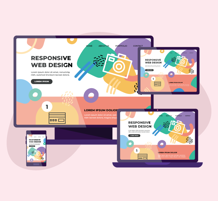
Mobile-First Design, within Paesh's realm of Responsive and Mobile Design, embodies a strategic approach where digital experiences are crafted primarily for mobile devices before scaling up to larger screens. It prioritizes usability and performance on smartphones and tablets, ensuring that Paesh's creations resonate seamlessly with users navigating the digital landscape on-the-go.
In Paesh's domain of Responsive and Mobile Design, Adaptive Design stands as the art of crafting digital experiences that dynamically adjust to the unique characteristics of each device and user context. It ensures seamless interaction across a spectrum of screen sizes and resolutions, epitomizing Paesh's commitment to user-centric design in the ever-evolving digital landscape.

W
o
r
k
w
i
t
h
u
s

We would love to hear
more about your project

Get started now

If you would like to work with us or just want to get in touch, we’d love
to hear from you!

Dubai

Meydan Grandstand, 6th Floor, Meydan Road, Meydan Freezone, Nad Al Sheba, Dubai, UAE

Islamabad

Office 101 & 102, First Floor, Abdullah Tower, Acantilado Commercial, Phase 7 , Bahria Town, Islamabad

Email
© 2024 | All Rights Reserved by Paesh